Calendar is one of the most commonly used control in PowerApps. PowerApps comes with the default Calendar component, but it has limitations. So, I created a custom Calendar component with Time control.

How’s this custom calendar component different from the Powerapps default component?
- Beautiful UI/UX
- Customizable primary and seconday color
- Time Picker
- More features coming soon…
Prerequisites before installing the component:
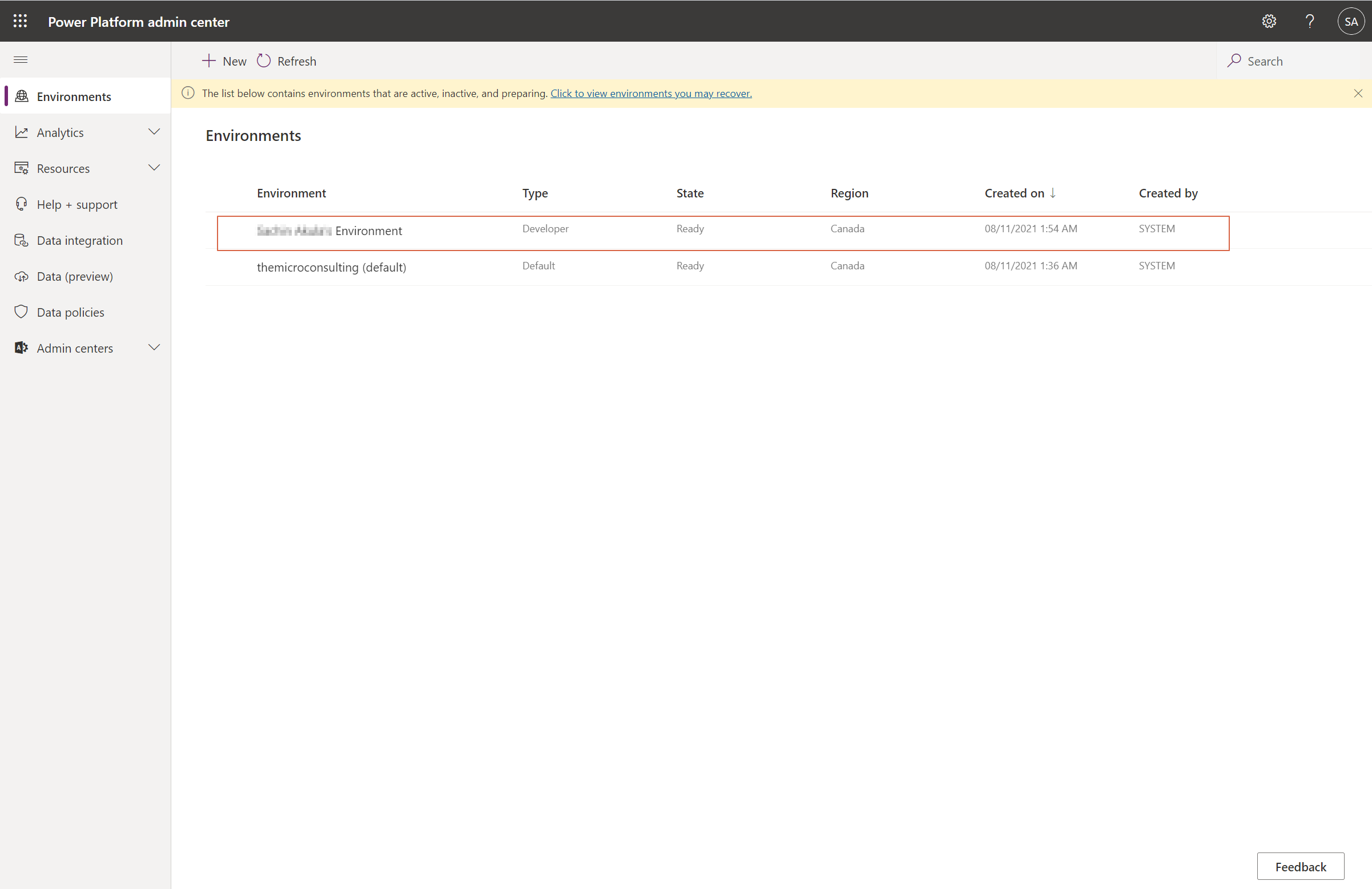
- Go to https://admin.powerplatform.microsoft.com/environments
- Select the environment
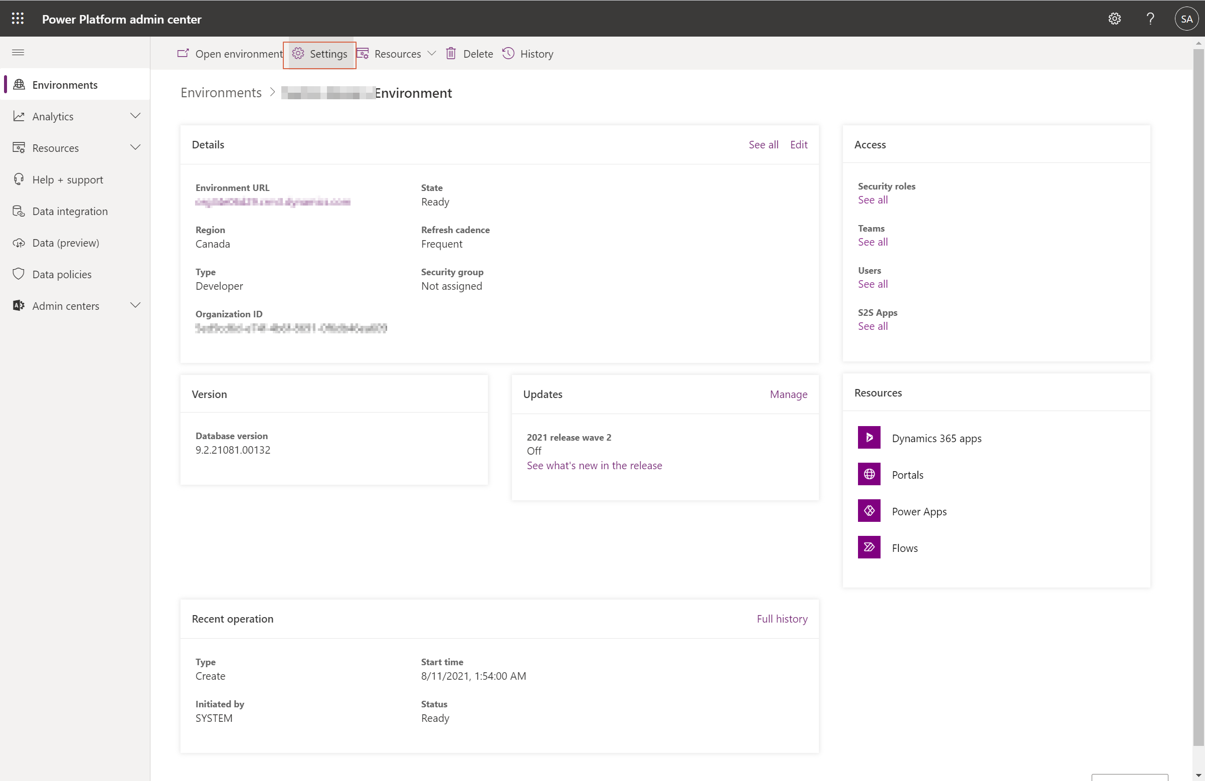
3. Click on settings
4. Expand Product and then click on Features
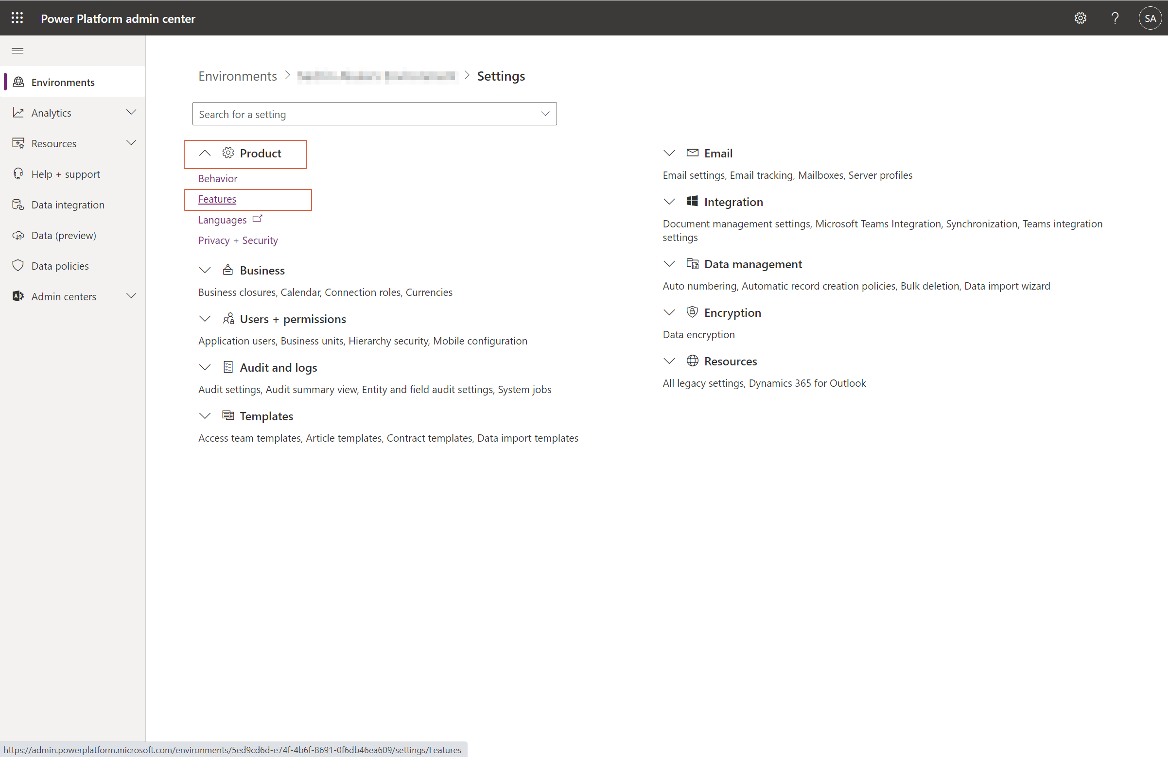
5. Toggle “Allow publishing of canvas apps with code components“
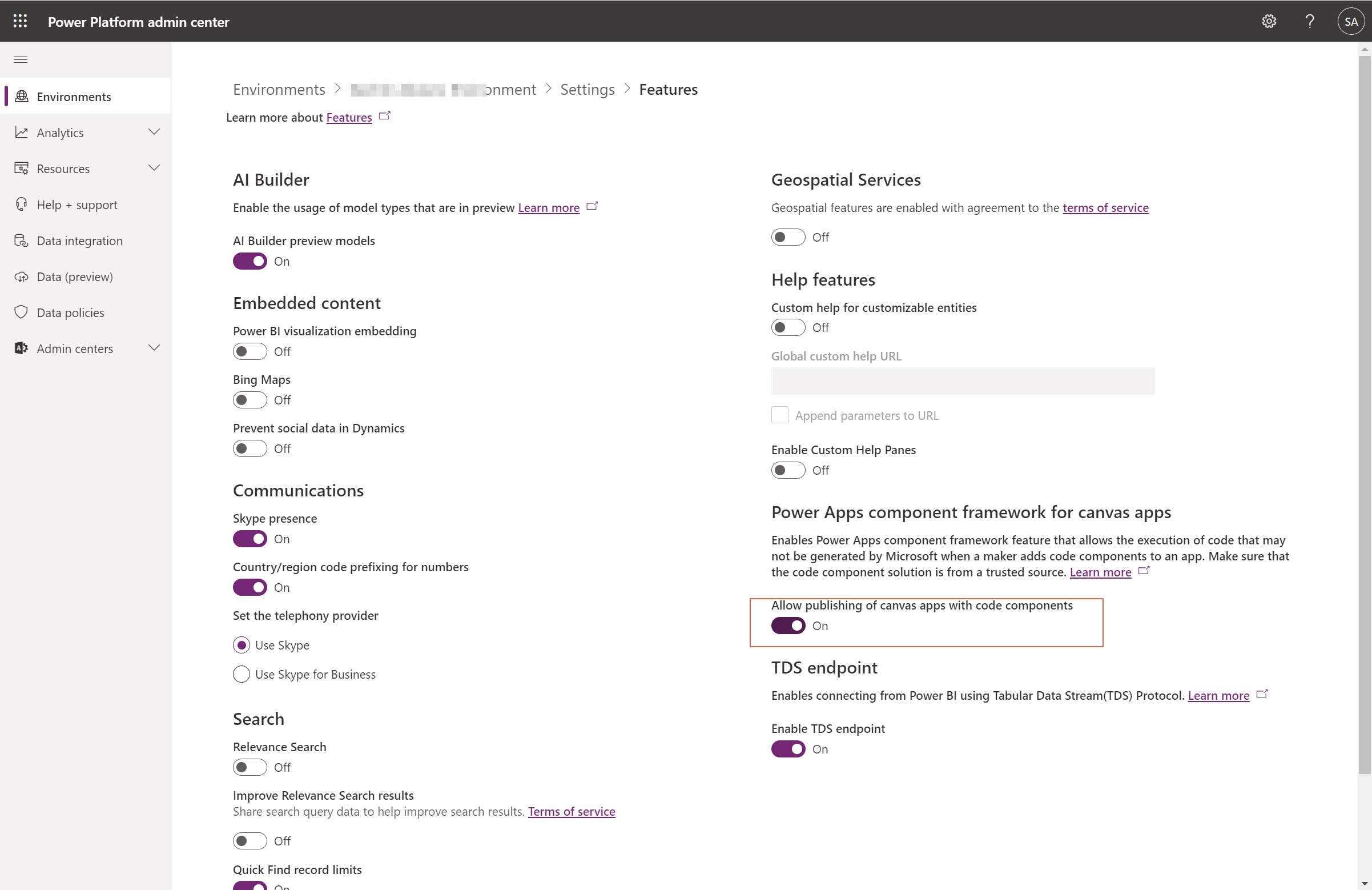
6. Make sure you Save after toggling that button
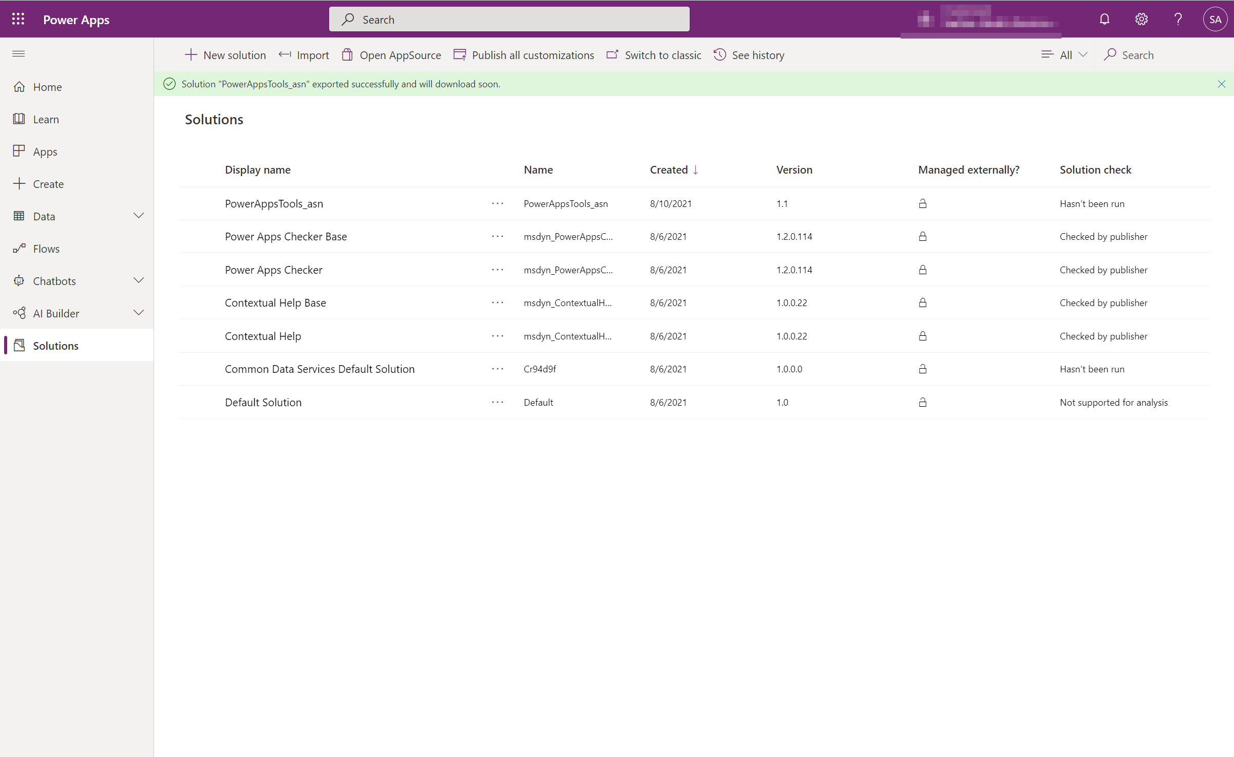
Importing Custom Component Solution:
- Download this managed solution
- http://themicroconsulting.com/wp-content/uploads/2021/08/PowerAppsTools_asn_1_1_managed.zip
2. Import this solution to the PowerApps solutions
3. If you’re app is already open, close it and reopen it again.
4. Click on that + Icon from left navigation.
4. Click on Get more components

5. Now select Code, then “ReactMaterialTimeComp” and then click Import

6. Expand Code Components section and select ReactMaterialTimeComp
That’s it you sucessfully imported the Date and Time Picker Component
How to use Powerapps Custom Calendar Component?
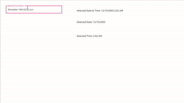
- Accessing dateProperty:
- Eg1: ReactMaterialCalendarTimeComp1.dateProperty
- Eg2: Date only: Text( DateValue( Text(ReactMaterialCalendarTimeComp1.dateProperty) ))
- Time only: Text( TimeValue( Text(ReactMaterialCalendarTimeComp1.dateProperty) ))

2. Set Default Date using a global variable or context variable. Use dateProperty property
3. Label property to change Date and Time Picker label
4. Primary Color property to change primary color
5. Secondary Color property to change secondary color
I hope this compoent will save atleast few of your pain points.
More features for this component will be coming soon!
If you have any suggestions or feature requests please use the comment box below.